
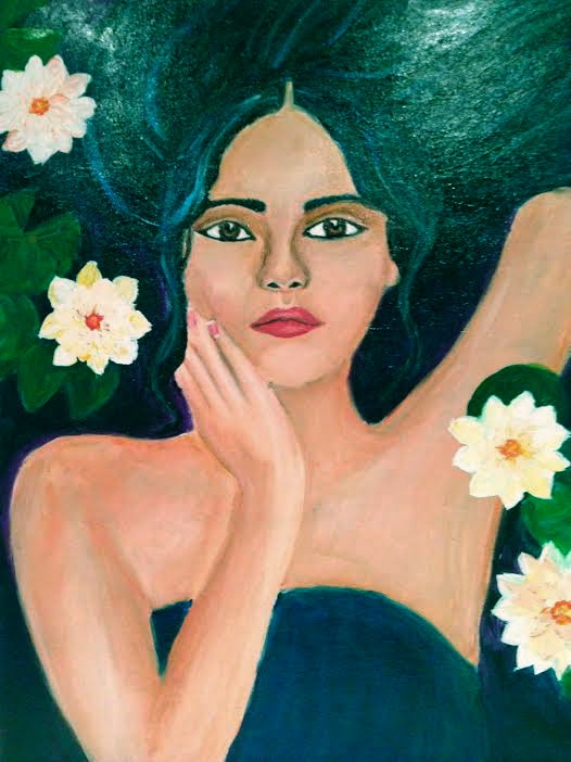
 Working on Blue Ophelia has been a journey. Although art can always be improved upon, I feel like Blue Ophelia is at a stage where I want to present her to the world. The layers of modge podge have created a reflective surface that resembles water, and I've used lots of paint to make my waterlilies 3D. The water lilies overlap Ophelia so it is clear that she is sinking under them.
1 Comment
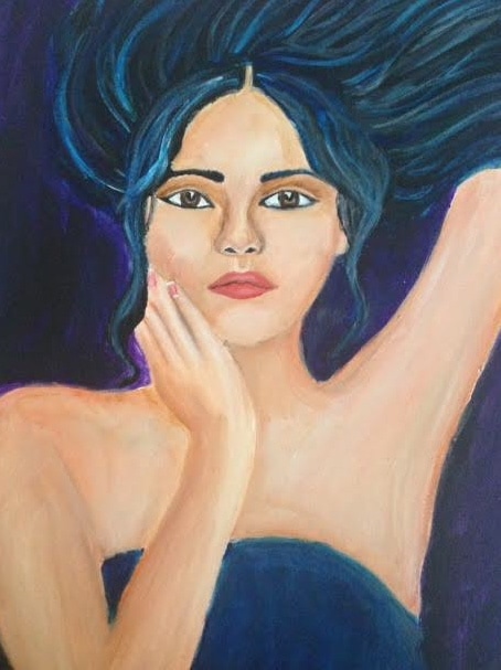 I'd like to thank all the teachers and members of the priory community that have sent me love during my first iteration of the portrait. This is my second (but no where near final version). I'm working on finalizing the skin tone and adding highlights to the hair. My next step is to make it appear as if she is underwater and add flowers floating to the surface.
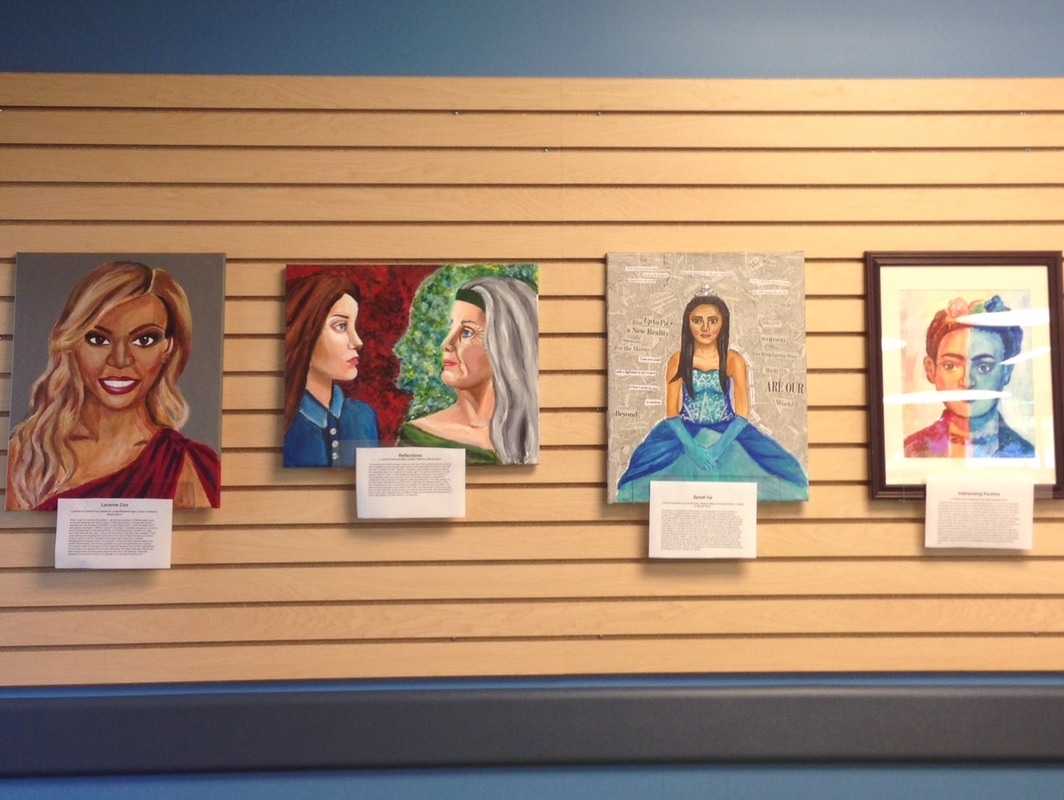 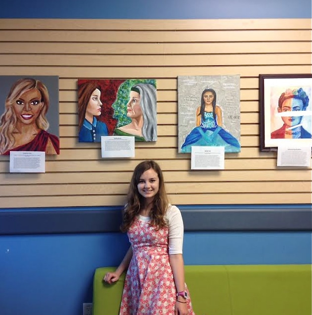 I have an exhibition in the Learning Commons. This gallery features all of my works except Blue Ophelia (still working on that one) and the meanings behind them. Thank you Ms. Lanctot for giving me the space and support to make this possible.
 This is the first draft of my final portrait Blue Ophelia. It is inspired by Artemesia Genteleschi. Gentileschi was a baroque artist famous for painting the unspoken pains of women. Her style was defined by darkness, violence, and biblical imagery. Instead of focusing on the bible like Gentileschi did, I chose to focus on one of Shakespeare's most tragic female heroines Ophelia. Ophelia is typically depicted with blonde/red hair and light eyes, but I chose to depict her as dark haired and Asian instead, because I find asian features to be beautiful. Although Ophelia traditionally wears a wedding dress, I chose to make the dress she wears here dark in order to blend into the background, emphasizing the drowning aspect of Ophelia. I feel like Ophelia speaks to my own need to be loved. Sometimes I feel like I extend so much love out to other people, but my love is often neglected or ignored. As a result I sometimes feel like I'm drowning in lonliness and sorrow. I wanted the painting to capture this pain.
I interviewed Ms. Sullivan today. Although I've had her as a teacher for Metals first semester, I didn't know very much about her personal history and I was pleased to learn more. Here are a few snippets from the interview.
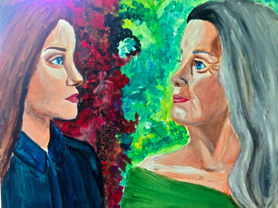
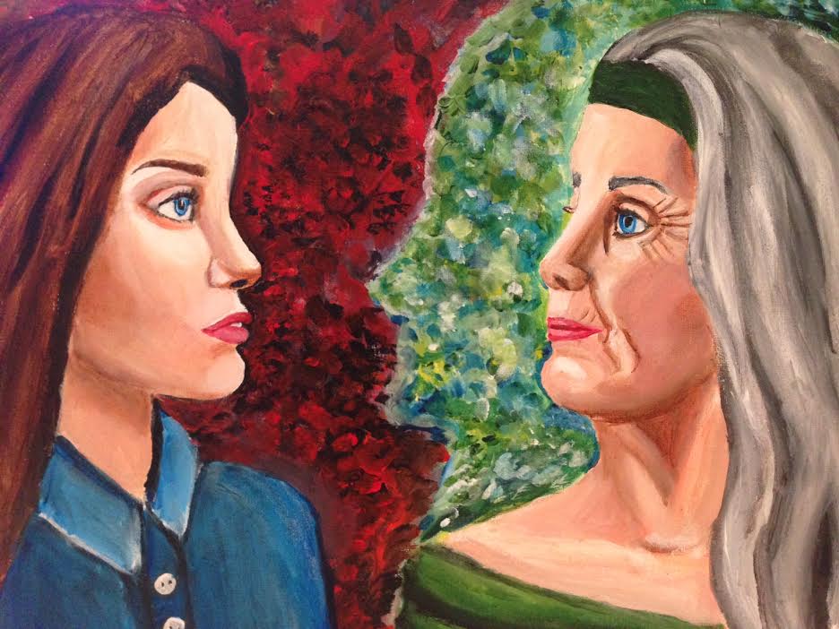
On Art and Technology: I think artists are good at embracing innovation, but I don't think new technologies should shape our ciriculum. I think there is lots of value in classic art like metal smithing. On Teaching: Art is a process, and I think the worst thing someone can do as a teacher is extinguish the happiness that comes from creating. Little kids have so much joy when they are drawing but often get discouraged when other people look at their drawings and say "Oh that doesn't look like a dog" (or whatever the object the kid is trying to draw). At the start of a drawing and painting course, I teach my students how to draw simple objects like balls or cubes. I'll have them follow along closely: I'll be like this is a line, and then they'll draw a line. In the end the objects all look the same, but the students feel accomplished. I think starting with the basics is very important to building confidence as well as skill. On Curating the PAC: This Sunday we are putting up a new show in conjunction with the spring concert, and I already know that its going to be my favorite. It's called Healing Hearts and the artists are all kids that have been hospitalized at Lucille Packard Children's Hospital. The exhibit features pictures of the artists work. When creating the exhibit I was focused on variety, there are scribbles, drawings, paintings and sculpture. The artists are anywhere from toddlers to young adults. The art ranges in subject as well: while there are rainbows, kids also focus on their experience being hospitalized. I'm really excited for this exhibit, I think its really moving and I'm looking forward to sharing it with the Priory community. 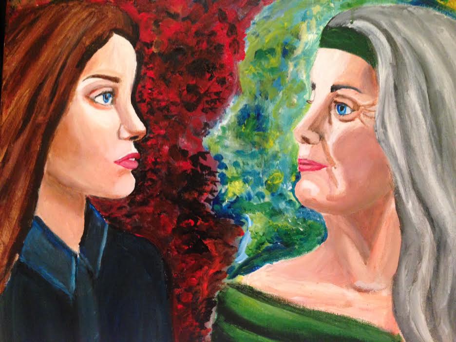 Hello Again. I'm back with my improved painting which I've decided to call reflections. This painting is about looking back on your past and the relationship you form with your younger self. The younger and older woman in the painting are very different. The younger of the two is full of passion (red back ground) and ambition (serious collar shirt), while the older woman has a sense of peace and relaxedness about her (loose clothing and headband). My goal was to make it look like the two women have a loving mother daughter relationship. This is probably not my final version but it is pretty close.
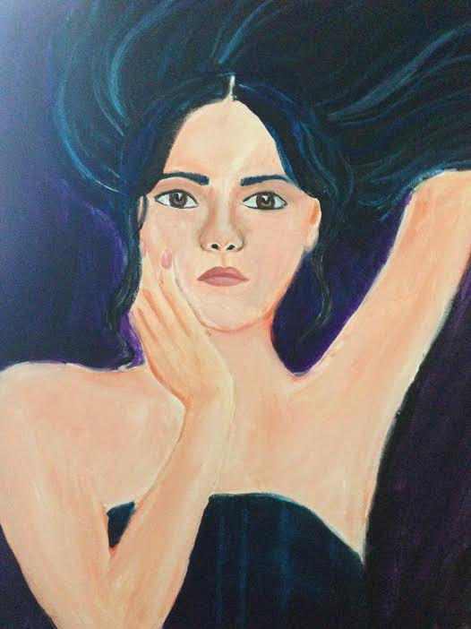
 So while everyone else was getting ready for prom I was painting. I might regret saying this later but this is the first first draft of a portrait that I don't entirely loathe. The back ground was super fun to paint, and the proportions aren't completely out of whack like they were the previous times I attempted this portrait. I'm sure it will look much better after I've met with my mentor though.
Progress Towards Goals:
I completed my Laverne Cox and Quinceañera Portrait. I interviewed Julia Feld. Set Backs: APs are coming up as are prom. My progress may be stilted due to my lack of time. Upcoming Goals: Interview Reed Sullivan about Curating. Finish portrait #4. Submit some of the art I've created to the learning commons. 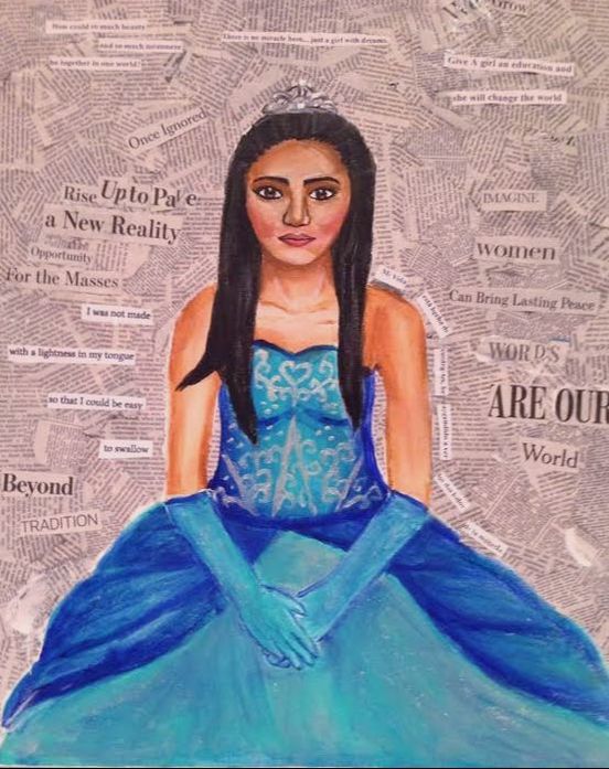 This is my last update of this week I promise. During these past two days, I have been working tirelessly to elevate my portrait from the mess you saw last update to what it is today. Most notably, I added gloves, redid the hairline, thinned out the eyebrows, took away some of the highlight and added a back ground (many of these were my mentor's (Ms. Thayer) recommendations hence the title). For the background I tried to rely on newspapers as much as possible but I couldn't help but supplement my own quotes in as well. This is more or less the final version (I might go in and make minor changes but nothing huge at this point). I'm proud of the way it turned out.
|
Margot HeronI'm inspired by amazing women, great art, and unforgettable stories. Thank you for joining me on this exploration of these topics through portraiture. |
 RSS Feed
